FLOW Analytics | Highlight the MIN and MAX on a Graph
Some clients have requested that we highlight the MIN and MAX points on a graph to stand out. With the below JavaScript, we can accomplish this feat.
1. Having your explore open, navigate to the Advanced Settings on the Explore screen.
2. In the Point Customization pane, paste this JavaScript:
var data = e.series._points;
let min = Infinity;
let max = -Infinity;
let key = "properValue";
for (let i = 0; i < data.length; i++) {
let value = data[i][key];
if (value < min) {
min = value;
}
if (value > max) {
max = value;
}
}
if (e.value == max) {
return {
color: 'green'
}
};
if (e.value == min) {
return {
color: 'red'
}
};
3. The Graph will now point out the MIN as RED and the MAX as GREEN, while keeping the other bars connected to the Theme applied.
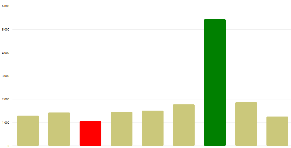
This is not limited to the Bar Graph, you can apply it to a Line, Area, Scatter Graph, etc. for example.
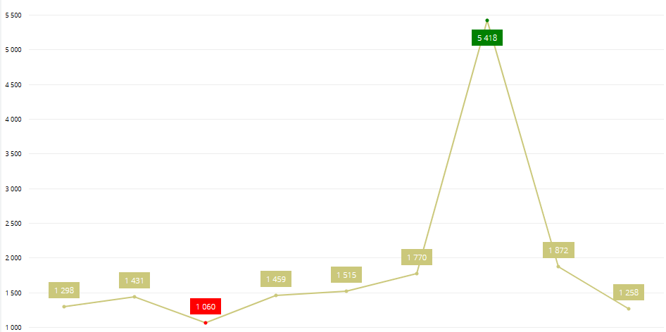
This is not limited to the Bar Graph, you can apply it to a Line, Area, Scatter Graph, etc. for example.
Related Articles
FLOW Analytics | Multiple Chart Types on 1 Explore
A good feature of FLOW Analytics is combining different chart types onto 1 explore. The requirement is that you have 2 or more MEASURES and 1 Group. And then decide if they need to be on the same Y-Axis - i.e., are you measuring big numbers with each ...FLOW Analytics | Highlight cell colours in Pivot Charts
A nice value-add to Pivot Charts is to colour certain rows or columns based on certain rules/measures. Open the settings of the Pivot Chart and scroll down to Cell Customization: The below will highlight each cell based on the below rules: In order ...FLOW Analytics | Datatim Base Query 7 | Vehicle Expense (VTRN) Table
This is showing you ALL expense data. SELECT * FROM vwa_vtrn If you want Diesel Consumption, build a separate Data Model and have a look at the next article titled: FLOW Analytics | Datatim Base Query 8 | Diesel Consumption (VTRN) TableFLOW Analytics - Tooltip Customization
Customizing the Tooltip on a graph helps with usability when it comes to larger numbers, for example viewing Revenue figures that stretches 7 or more digits. Copy Paste the following syntax into the Tooltip Customization box of the explore. You can ...FLOW Analytics | Set Up a Client/Supplier profile so they can log in and few their own data
Some of our clients have started requesting that we provide their clients with logins to Flow Analytics so they can see their own data. This will be requested more going forward. I am going to use Zacpak from the Moosas environment to showcase how to ...